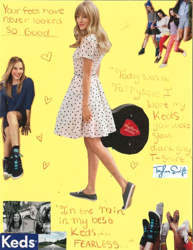
Collage Advertisement
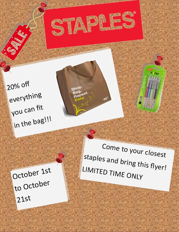
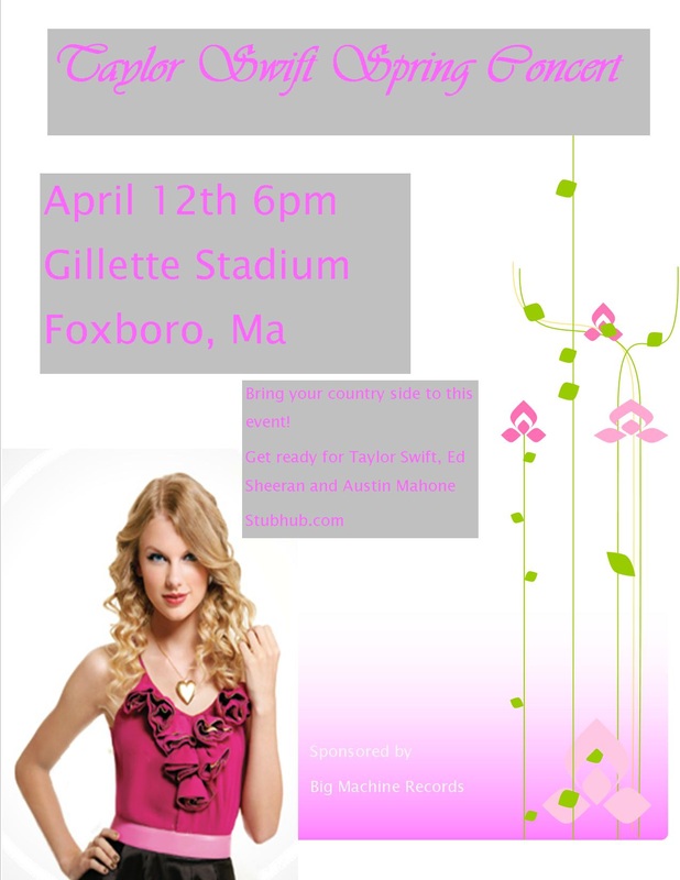
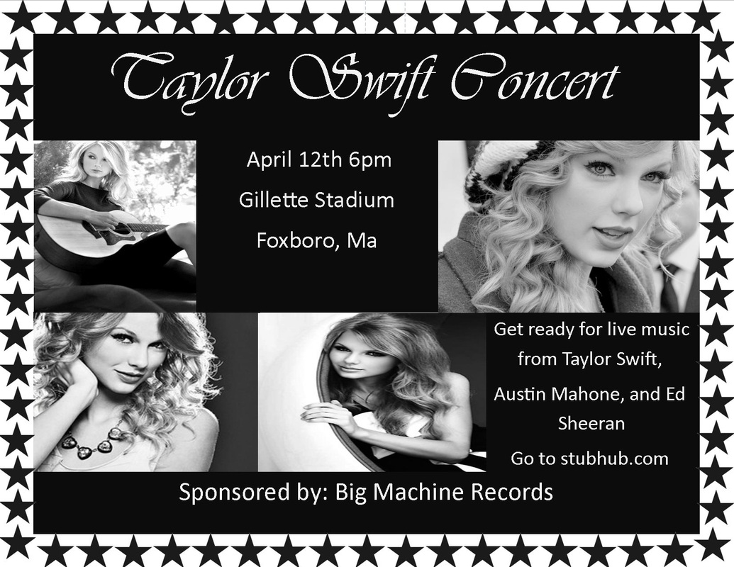
Flyers
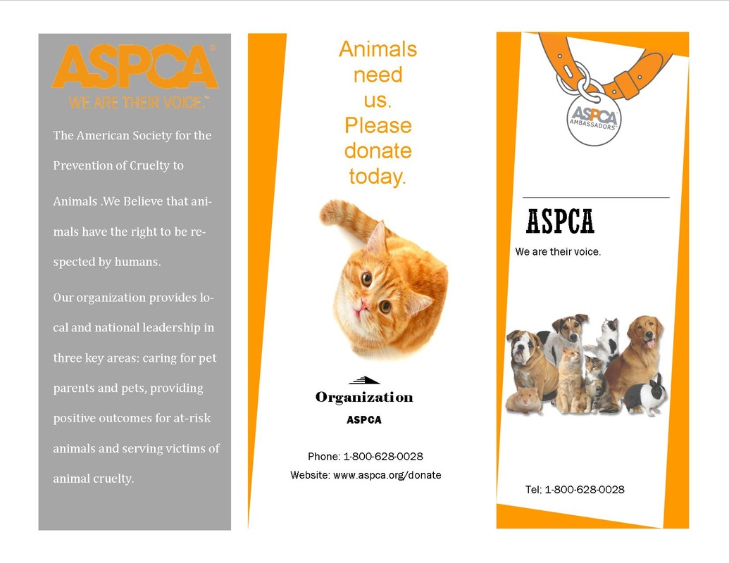
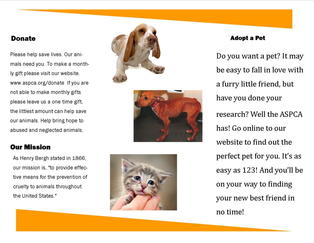
Practice Brochure
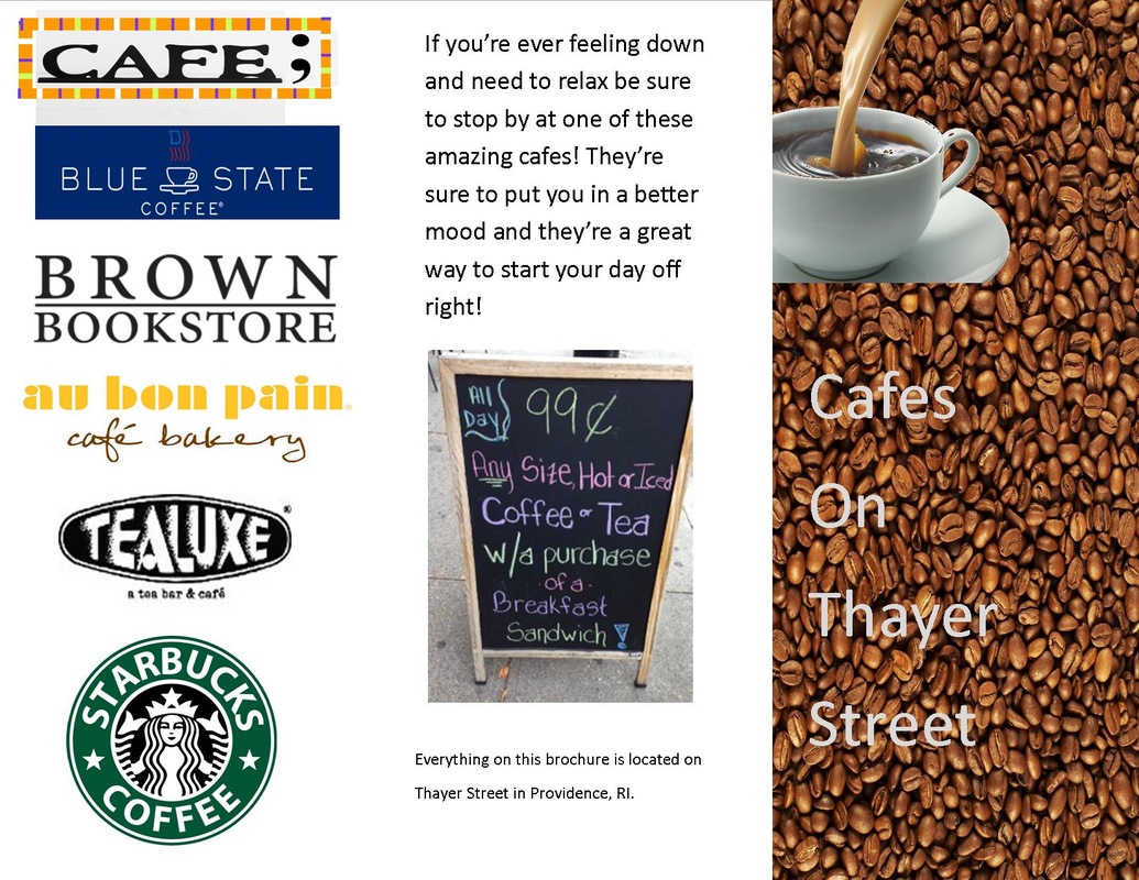
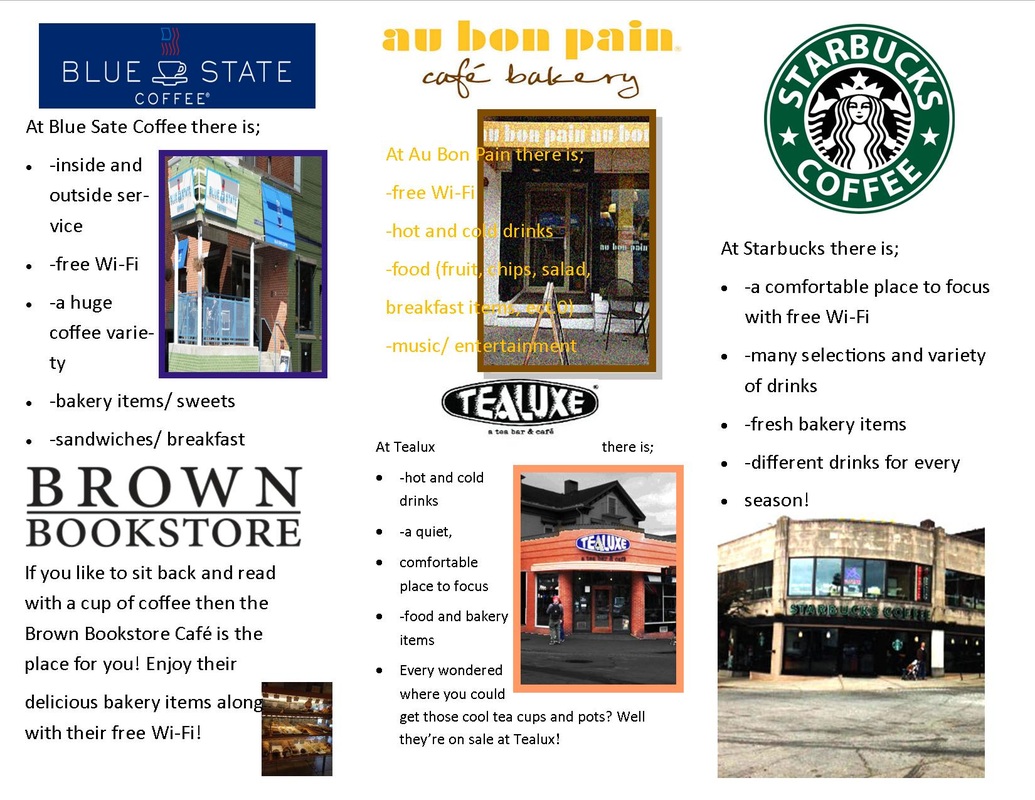
Thayer Street Brochure
Modified Images (Adobe Photo Shop)
|
|
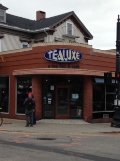
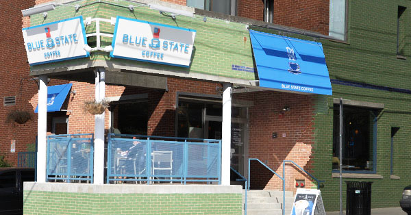
I played with the brightness and contrast. I selected the Store Front and made it brighter than the rest. Then I selected the inverse and made the rest of the picture black and white.
|
|
|
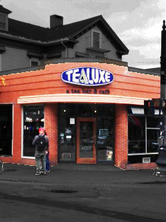
For this picture i played with the brightness and contrast and tried to make the words on the banner easier to read. Then i used a filter that made the picture look grainy.
|
|
|
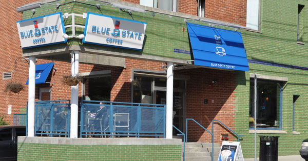
For this picture i played with the brightness and contrast. I selected just the store front and made it brighter and more clear than the rest. Then i selected the inverse and made the outside darker and less clear, so that your eye directly goes to the cafe.
|
